ASPALL SUFFOLK CYDER
Staying at the forefront of branded beverage dispense doesn't happen by chance. Celli Group's sales representatives are constantly monitoring what is happening within the global brewery market, seeking out new ways to innovate its standard font offer with breakthrough products that redefine what is possible.
The ability to foresee changing need in the industry is an essential part of what Angram do. Our customers rely on us to identify the trends that may be signaling a change on the horizon, and leverage these into new ideas such as Aspall's new draft tower; a product that keeps the brand where it needs to be.
Angram is always committed to ensuring all beer types are presented and dispensed in the best way possible, so that consumers get to experience them just as the producer intended. And it's thanks to this commitment, as well as Angram and Celli UK's experience and skills, that the new Aspall's beer font has been created.
A draft tower serves to attract customers and build brand loyalty, all while providing distinguished character to the establishment courtesy of some of the most recognized breweries. Beer brands and their bespoke draft tower by Angram are strategically selected to maximize both sales and name recognition.
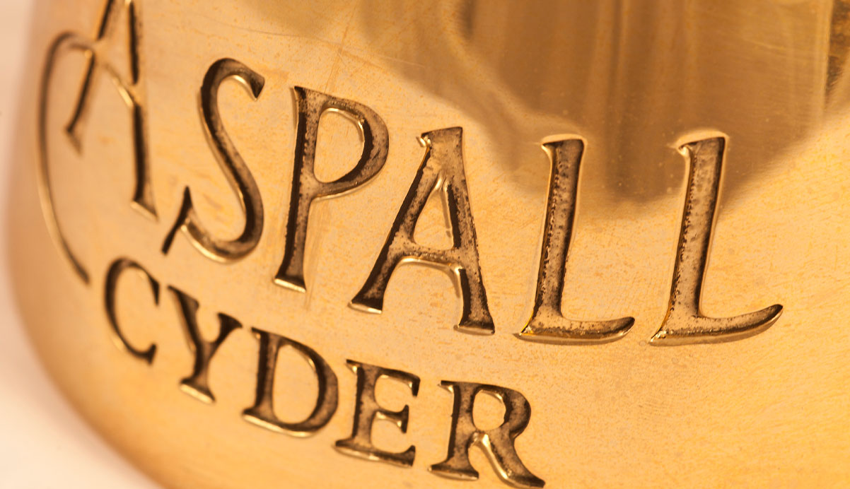
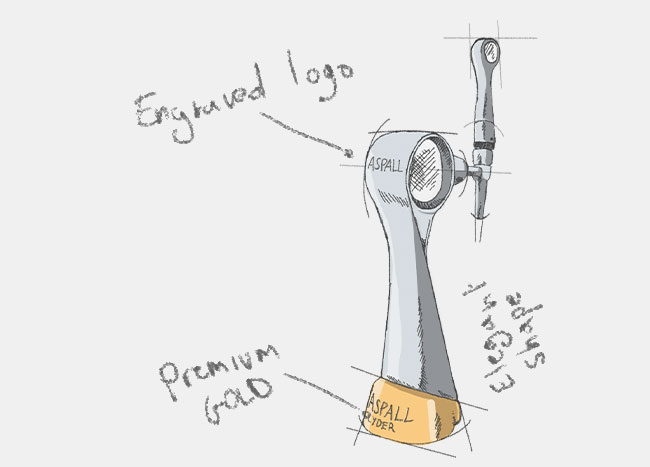
We took inspiration from Aspall itself - the Hall, the village, the cyder house and the beautiful agricultural land of Suffolk. The shape of the new draft beer tower became elegant and organic, taking inspiration from natural shapes and forms. The intricate detail of the branding and font handle are a nod to Aspall Georgian roots.
The premium silver finish over the stainless steel case has always felt right, and through photo real visualisation we added a complementary gold base, bringing the pure cyder colour into play. Illuminated branding on the side of the beer font completed the vision, making the Aspall name stand out wherever it was placed.

We think that giving motivated bar owners access to a branded draft tower is a great way to build a real connection between the consumer and the brewery.
The finished product catch the eye of any consumer and creates a new drinking experience when ordering an Aspall beer from one the new draft beer towers designed by Angram.
Customers feel the history, heritage and premium quality of the Aspall brand.
Read about the new design project for the Belhaven's beer tap tower by Angram, one of the most creative experiences for the Celli UK team. The new beer font design for Belhaven Best and Best Extra Cold was created alongside Belhaven's marketing team. Working in close partnership we were able to marry a clear and focused design intent with a manufacturing route that met both the creative and commercial brief.
Customers love this draft tower because it stands out, and it's beautiful – a talking piece for bartenders and staff. Anything that makes a product unique helps it sell, and when you have one or more of these draft towers standing majestic but separate from the main draft system, it draws people in.
Complete your draft beer dispenser by taking inspiration from Celli UK's wide range of draft beer dispensing products, spareparts and accessories. All types of beer tap, cask ale pump, custom beer tap handles, beer faucet and more. Find out the high quality of Angram's beer equipment and Angram beer engine for the most authentic draught experience.