INNIS & GUNN

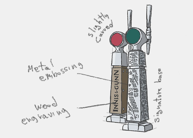
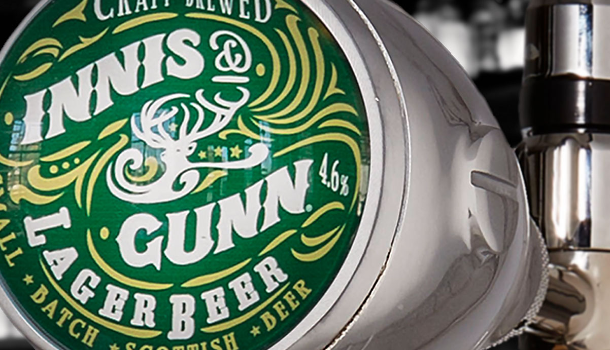
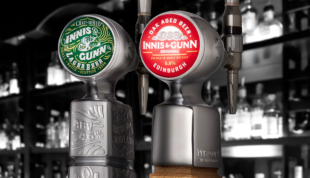
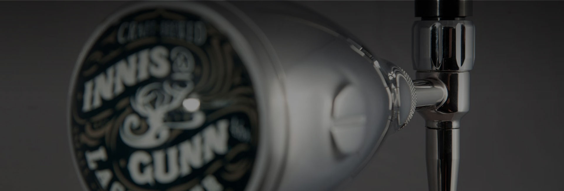
Angram has worked collaboratively with Innis and Gunn for many years, exploring ideas, developing their potential and bringing effective bespoke product solutions to market. The Innis & Gunn's new beer faucet is the perfect example of how this close relationship has delivered powerful results and of effective bespoke brand communication.
The UK market for premium draught lager is extremely crowded and competitive, and among consumers the demand for quality is paramount. The draft beer faucet therefore needed to deliver the required level of style and sophistication, stand out from the crowd, and capture the attention of quality-conscious consumers.
Brands often need something new and unique that sets them apart form the crowd, and if that something doesn't already exist the Angram team will design, engineer, prototype and manufacture a bespoke solution. Our experience extends to all areas of dispense lighting systems and custom marketing materials, which can be seen in recent projects completed for other beer brands such as Beck's, Heineken, Somersby, Tuborg and more.
We are also focussed on innovation and will seek out advances in technology, manufacturing, materials (not only stainless steel) and processes to keep us at the forefront of the draught beer dispensing market. Our customers rely on us to develop new products and ideas, to be their partners in innovation and provide custom solutions that help their brands grow.
In creating the new Aspall's beer faucet, the Angram design team faced several challenges. The most significant was to deliver the design intent for the brand within the confines of manufacturability and budget. Maintaining the brand image was important as this new tap for the Aspall brand is the new beer dispense icon in the market.
We took our design cues from the industrial heritage of Edinburgh, where the Innis and Gunn Brewery Company is based. A long history of engineering and high architecture makes the city what it is today, and this is reflected in the uncompromising design details that are the bedrock of the design.
Angram built on the industrial heritage by machining the details into the font body. Therefore the design incorporated the origins of the location and the brand, and allowed the team to change the embossed details simply through new machining processes.
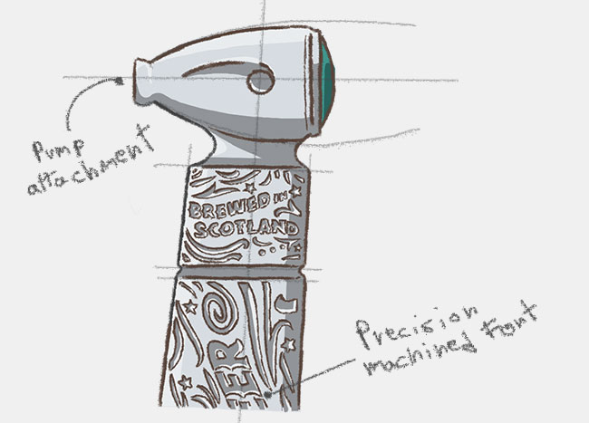
As a contrast to the modern stainless steel finish, the long middle section was replaced with oak, a nod to the aged oak beer customers know so well. The result is a traditional yet modern, precise yet organic beer column, where old and new are combined harmoniously as a whole. It's fair to say these draft beer fonts stand out on any bar.
The vision of this design and manufacturing project was to help Innis and Gunn deliver a best-in-class draught experience, by bringing the standards and rituals of the brand to life. This design helps the brand to engage with consumers and through quality design and execution reinforces the brand's credentials and outpaces the competition.
The result is truly unique. The body of the draft tap is made from stainless steel and it clearly communicates the core values of the Innis and Gunn beer brand, and appeals directly to the quality and taste demands of UK premium lager drinkers.
Our vision is to make drinks dispense better together. We believe our success lies in working ever more closely with our customers, building long-term and mutually beneficial relationships. We work hard to ensure we fully understand our customer's businesses so that we are best placed to fulfil their dispense and branding needs. We are more than just a supplier; we are their partners. From fonts and taps to branded glassware and pumps for beverage coolers, our products are integral components within bars and retail outlets, delivering quality performance and value. Through the years, Angram assembled a dedicated team that has the skills, expertise and desire to continue to drive the business forward.
Also discover the new design project for the Belhaven's beer tap tower by Angram. The new beer font for Belhaven Best and Best Extra Cold was designed working in close partnership with the Belhaven's marketing team. The two teams together were able to marry a clear and focused design intent with a manufacturing route that met both the creative and commercial brief.
Complete your draft beer dispenser by taking inspiration from Celli UK's wide range of draft beer dispensing products, spareparts and accessories. All types of beer tap, cask ale pump, hand pull beer pump, beer engine and more. Find out the high quality of Angram's draught equipment and Angram beer engine for the most authentic drinking experience.
